Executive Sales Dashboard
Operational AnalyticsInteractive business intelligence dashboard providing C-suite executives with real-time sales insights, pipeline analytics, and team performance metrics.
Overview
💡 Challenge
Executive teams lack unified visibility into sales performance across regions, products, and teams. Manual reporting is time-consuming and provides outdated insights, making strategic decision-making difficult.
⚡ Solution
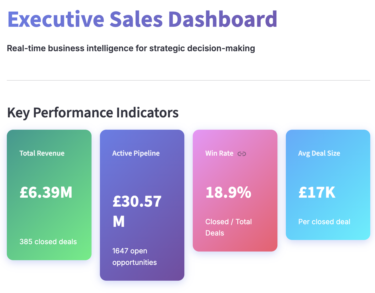
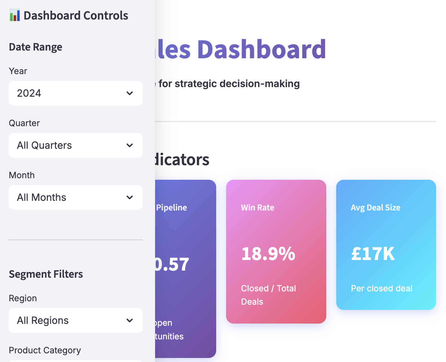
Built an interactive Streamlit dashboard with real-time KPI tracking, revenue trend analysis, pipeline health monitoring, and team performance leaderboards. Includes dynamic filtering by year, quarter, month, region, category, and sales rep with YoY comparison capabilities.
🎯 Impact
Enables data-driven executive decision-making with instant access to key metrics. Automated reporting saves 15+ hours weekly and provides strategic insights for resource allocation and performance management.
Technical Details
🛠️ Tech Stack
✨ Key Features
- ✓Real-time KPI dashboard with revenue, pipeline, win rate, and average deal size
- ✓Year-over-year revenue comparison with growth percentage tracking
- ✓Interactive filtering by year, quarter, month, region, category, and sales rep
- ✓Revenue trend visualization with monthly time series analysis
- ✓Sales pipeline funnel showing stage-by-stage conversion
- ✓Regional performance breakdown with horizontal bar charts
- ✓Team performance leaderboard with revenue and deal count metrics
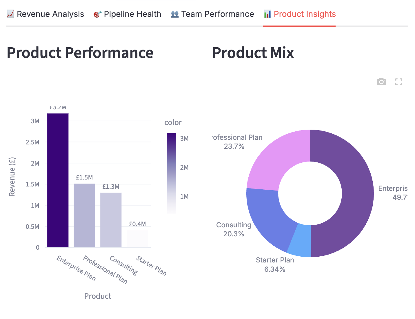
- ✓Product performance analysis with category mix visualization
- ✓Quarterly revenue tracking with comparative bar charts
- ✓Top 8 sales performers ranked by total revenue
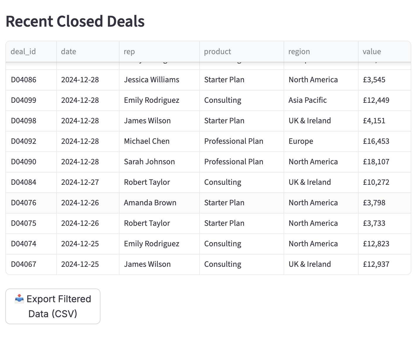
- ✓Recent closed deals table with export functionality
- ✓CSV data export for filtered datasets
- ✓Premium gradient UI with color-coded metrics
- ✓Multi-tab interface for organized insights
Key Learnings
- →Executive dashboards require clear hierarchy with KPIs prominently displayed at top
- →Color gradients and visual hierarchy guide attention to critical metrics
- →Interactive filters enable self-service analytics for different stakeholder needs
- →Tabbed interface organizes complex data without overwhelming users
- →YoY comparisons provide context that raw numbers lack
- →Export functionality is essential for executives who want deeper analysis
- →Professional UI design increases dashboard adoption and credibility with C-suite
📊 Data Notes
This project uses synthetic/open data to demonstrate capabilities while maintaining privacy and confidentiality. All methods and approaches are applicable to real-world scenarios.